
Irina Benedyk,
Assistant Professor
CSEE Department
University at Buffalo

Problem Statement
Need to design simple, easy to understand app that will be used in dark settings.
Note: Interaction with app is a secondary activity that should be seamless and requiring limited attention.
User research
In-person, think-aloud user research sessions with five young adults from diverse cultural, linguistic, and educational backgrounds
Two tasks:
• Join a new activity and simulate two to three interactions with other "participants”
• Navigate to the results page to check the statistics from the completed activity
Assumptions: both joining an interaction and interpreting the resulting statistics would be intuitive

User Pain Points
Need to split attention with main activity
App interface must be intuitive with as little different screens as possible, main screen should be operated by simple tapping (without looking)
App usage is intended for dark environment
Color should be informative, limited or none text on the screen, larger buttons
Users will have limited time to learn the app
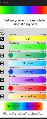
Only 2 main screens: mood-set up and activity itself, find a design with simple log-in and joining the team
Digital wireframe
- Welcome page
- Mood set up
-
Both pages are encountered before joining the activity
-
Mood set up is necessary to start interactions
-
Participants understood the intend for both pages without additional explanations


Digital wireframe
- Ready for interaction page
- Interaction page
-
4 out of 5 participants understood what is needed at a first glance
-
One participant struggle for 3-4 seconds going back to main screen and then joining again

Digital wireframe
- General statistics page
- Individual statistics page
-
General statistics was intuitive for participants and they easily opened individual statistics for the last interactions
-
2 out of 5 participants understood impacts in reverse order of individual statistics page, 1 participant expressed frustration saying that it is not clear what each row represents

Low-fidelity prototype flow

Recommendations
-
Redesign the statistics screen to be more visual
-
Redesign the statistics screen by adding interpretations of the result
-
Add “Press here to interact” or similar to “ready for interaction” page